Find why people gave up
Read the reasons customers stopped, ranked by how many conversations each one cost.
Use this when bookings drop, or a client asks why their customers keep leaving.
Set the time range in the top bar.
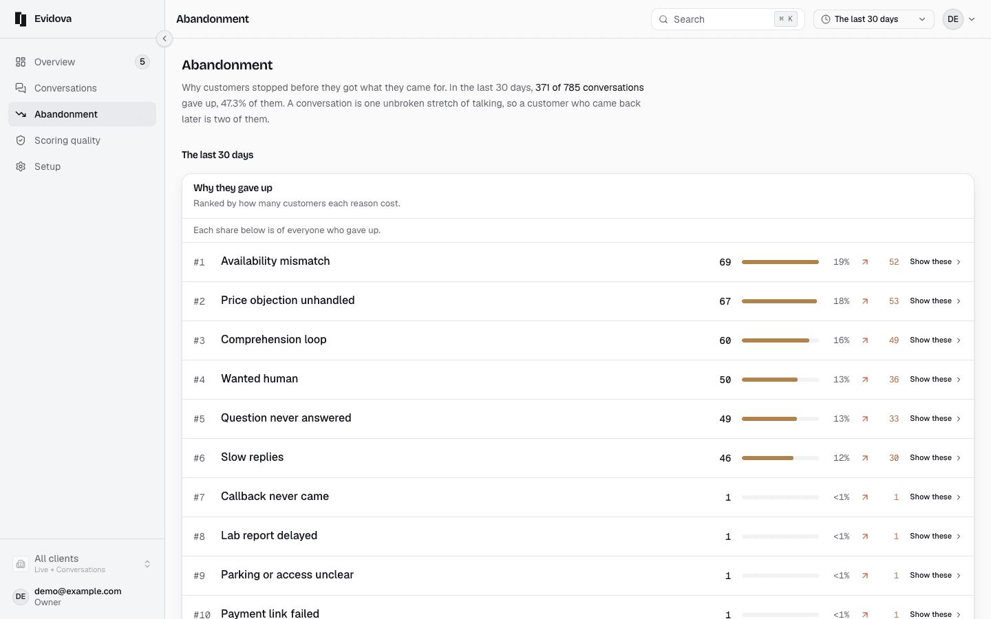
Open Abandonment in the left rail.
Its opening line says how many conversations gave up, and what share that is.
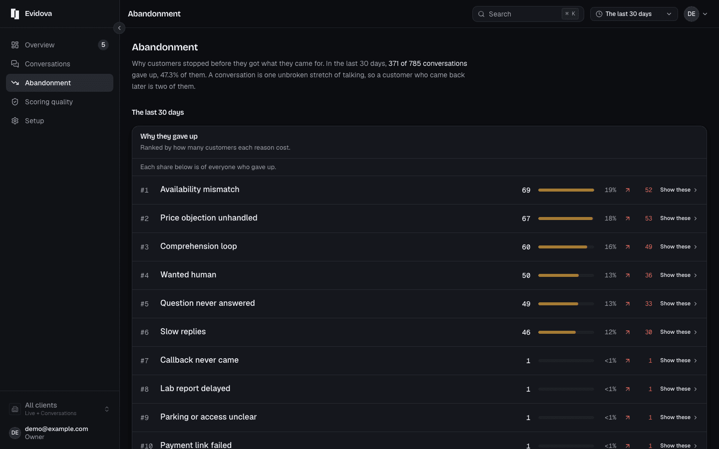
Read Why they gave up.
Reasons rank by how many customers each one cost.
Read the sentence under that list.
It accounts for every conversation that gave up, including the ones nothing has looked at yet.
Read Where in the conversation they gave up.
The bars show how far conversations got. Each numbered drop off the side is one reason.
Click a drop, or the last bar, to open the conversations behind it.
Click Show these on a reason.
Same list, narrowed to that one reason.
Read Which client it hits, if more than one client had traffic.
It ranks clients by the share of their conversations that gave up, worst first.
What the screen's own words mean
| Time range | The last hour, Since yesterday, The last 7 days, The last 30 days, Since I last looked |
|---|---|
| Each reason row | The count, the share of everyone who gave up, and the change against the range before |
| Could have been saved | Yours to fix, in how the agent answers |
| Needs a product fix | A defect upstream. No reply would have saved it |
| Copy as an image | The chart as a picture for a slide |
| Download CSV | The cause ranking as a file, with the line that says what it was taken from |
Reading it right
- Open a handful of conversations behind the top reason before you change anything. A reason is a label over a group; the transcripts say which words failed.
- The lower half of the screen is a weekly report, and the top bar does not change it. It carries its own ranking, weighted by what giving up cost.
- Reasons we think are missing counts toward nothing until somebody names it.
Read next
- Prove a fix worked · Show that a change moved the number, over the same time range and the same traffic.
- Check you can trust the scores · Read the agreement figures for your own workspace before you act on a score.
- Investigate one conversation · Open a single conversation and see which turn broke which rule, and why.